maandag 12 december 2011

Portraits
capturing images with emotional impact


There are several different ways to compose a portrait. You have to decide where to place the subject, how much of your subject you want in the frame, which format you want to use and where you want to focus.


Here are two different shots of C, sitting at the table, reading a book on her iPad . I framed her in two different ways, using the square format. The first one shows some of the context: the table, her iPad, the light coming through the french door to the garden. The second draws the viewer closer and shows C's concentrated gaze (but not what she's gazing at) and the curves of her hair and shoulders, sculpted by the sunlight.


Here's another kind of portrait that shows only part of the subject. It is of my father holding a cup of coffee. The focus is on his hands and the mug between them. You can clearly see his aged hands, his wedding ring and the text on the mug. The shadows of the sleeves around his hands make him look a bit vulnerable. I chose to crop the original into this format, that leaves out all distracting details and draws the viewer straight into the story behind the portrait. I love that the mug is positioned exactly in the middle of the table, as you can see by the dark straight line leading out of the frame, formed by the space between the two table halves.


I also took some shots of my father cooking a meal. The light in the kitchen gives these images a completely different impact, which is enhanced by the context: action instead of idleness and tranquility. With every shot i moved in closer; the first shot shows a lot of kitchen context, the second one is focused on my father's face looking up at me and the third one shows only a part of his profile, completely concentrated on his work, with the kitchen utensils only a vague blur in the background.

Light is very important when shooting portraits. You can use the light to shape or shade, to enhance or soften parts of your subject, you can use it to sculpt the contours. The use of light affects the impact of a portrait in a major way.


Here is a portrait of my dog BiBi. She was sitting on a chair, focusing all her attention on someone holding a cookie, while the light created a soft halo around her head. I really captured some of her essence in this shot.


dinsdag 6 december 2011

Good Design
arranging and composing vignettes


We were challenged to create vignettes, using principles of good design to compose our images and arrange the objects within the frame in a visually appealing way.

I chose these three completely unrelated objects and tried to arrange a relationship between them


I put the three objects on a black tablecloth with a subtle pattern of twigs and leaves. This pattern emphasizes the dead leaf that gets the main focus in the foreground. The curve of its stem crosses the curves in the pattern in an attractive way. The antique copper bell is more (but not quite) centered in the frame, slightly out of focus and only a small part of it's stem is visible. The copper coins are spread in a blurry half-circle around the bell, they lead the eye out of the frame and away from the foreground, while at the same time repeating the curves of the leaf and the bell. The choice of objects (dead leaf, copper bell, money) and the way they are styled here allows viewers to give their own meaning to the image.


After this assignment using inamimate objects I tried to 'style' nature


I took a shot of these drops clinging to the umbel of a decaying hogweed, using a shallow DoF (with an iphone this is possible with the 'tap to focus' feature) to create a dreamy athmosphere. The next shot I took when I accidentally brushed the hogweed and the drop fell. This time I focused on the background, so the falling drop became blurry, creating a completely different visual effect.

For the second assignment we needed to style just one object, effectively using all the external factors like light, shadow, surface, lines, DoF, positioning and framing to create a compelling vignette.


This is an urn that contains the ashes of some of our pets that died over the past years. I tried to style and frame it in a way that conveys some of it's significance. I used the light above the table to accentuate the dust on the lid. The light gives the surface of the table and the blurry background a nice warm orange glow, which 'suits' the deep blue of the urn. The other lights in the room make starry reflections in the lacquered coating of the urn and turn the mother of pearl of the butterflies into gold. The lights also 'sculpt' the urn with a thin shiny curve around the top right that separates the urn from the background. There is a nice round shadow on the table and a small diagonal of light in the bottom of the frame. The horizontal line that separates the lighted surface of the table from the shadowed background forms the perfect 'horizon' dividing the frame. All these elements work together to give a deeper meaning to the shot.


One morning sunlight fell on the table through a glass of water and I tried to capture, style and frame the beautiful reflections, using all of the design-principles to arrange the shot

The left shot's main focus is on the reflection of the light within the long rectangle of shadow. The frame is divided into 3 slightly diagonal parts. The blurry circle of light in the background overlaps part of the middle rectangle and only a small part of the glass is visible. The image on the right shows more of the glass, dividing the frame differently. One third of the frame is filled by the glass and the rest of the frame is divided in two by the diagonal line between the shadow and the rest of the table. The blurry circle of light now does not intrude upon the shadow, but stays in it's own area. All in all this gives the image a more balanced feel.


Since design was on my mind all the time during this week, I started to see it's use and effect everywhere. Here are two shots I took while shopping in Den Haag. Two completely differently designed shopwindows.


The left shot is of a bakery selling confectionery for the feast of Sinterklaas. It is very busy, colorful and full of curves, and particularly attractive to children. The other one is of a furniture shop, very tranquil, almost monochromatic in color, lots of straight lines and empty space.

I am crazy about machines. One day i spotted one right in the middle of a field and I stumbled down a slope to study it's design up close.


I really love all the tubes and cylinders and pipes and screws and all the red covered with black tarry soot and drops of water. A machine might be the most well designed thing ever.....! In any case somebody really spent a lot of time thinking about its design and it is absolutely very deliberate and purposeful. I love how that shows in all the little details in this collage.

dinsdag 29 november 2011

Designing with color
creating depth, balance and magic
Color can make or break a shot. The use of color can add depth and movement to an image, and create balance. It can draw the eye into an image and lead it out again. 
One morning I got up and saw the sunlight shine through a bunch of gladioli in the living room. The beauty of their bright red, orange and yellow hues inspired me to make this photo collage

Using complementary colors can emphasize contrast, thereby extracting a subject from its background. 
Using repetition of the same color in an image helps create balance and continuity.

In the left image I enhanced the red color of the leaves and the green of the grass. Because of this stark contrast the eye is immediately drawn to the leaves in the foreground.
In the right image the focus is on the front branches. Their deep, bright red colors are repeated in the background, thereby creating a tranquil balance.
For the midweek challenge we were asked to make our colors 'pop' by post processing our images and experimenting with different hues and different amounts of saturation.
Here I took an image of a rose and boosted the colors three different ways. Top left is the original salmon colored rose, top right the toned down and softened version, bottom left the extravagantly color boosted version and bottom right has had a magical color shift: purple-pink petals and neon-blue leaves. Four totally different flowers!

While looking for a 'color pop' I stumbled upon the scene in the left image, where the late afternoon sunlight fell on this bright red goal post and literally made it pop out of the contrasting green grass. The mill and cows in the background make this a typical dutch image.
The second shot was taken a few days later, in completely different circumstances. The weather was damp and foggy and everything was grey. The guy in the orange suit was jumping upon the boat when i took the shot, literally popping out of the drab and desaturated background.


The effect of color is greatly influenced by the light. Soft or filtered light diffuses the brightness of the colors and evokes an atmosphere of tranquility and peacefulness. In these shots you can clearly see how the soft morning side light, filtered by the trees, makes this path in the woods look dreamy and a bit surreal. 

I experimented some more with color, light and reflections and made this study of a single magenta glass bottle, shot from different angles. I find the different impact of every single part of this collage utterly fascinating!


woensdag 16 november 2011

Black and White photography pt 2
honing the eye and sculpting with light

Our first assignment was to look for graphic lines and see how they translate to black and white in different situations. How does the light, the angle you take and the arrangement within the frame influence the impact of your shot? Exoploring this in black and white is a way to hone your eye, to learn to see what works and what doesn't.

I went to the bridge and took shots of the grey blocks of concrete in the water, from different sides and angles, both before, during and after a boat passed by. The way the light hits the concrete and reflects the movement of the water is clearly visible in these shots.


Some days later I was sitting at my table when I noticed the way the light coming in from the window was reflected and distorted by a glass of water and some bottles. By converting these images to black and white the details of these reflections are more clearly discernible, and the images become more captivating. 


The depth of field can be used to vary the main focus in the shot, thereby dramatically altering the impact of the image. In the second image the DoF makes the beveled letters on the small bottle almost pop out of the glass.
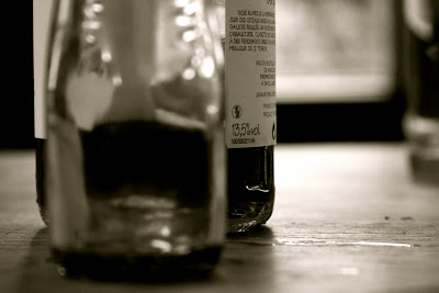
I also like the way the label on the wine bottle in the third shot is sharp and crisp, while the rest of the image is out of focus. and the way the horizontal stain of spilled wine is clearly visible on the table in the fourth shot. 

In black and white photography you can effectively use the light to sculpt and shape your subject matter. The light can accentuate contours and the shadows can enhance the effect of the light and make (parts of) a subject pop out.


Here are some shots of my dad. In the first shot I used the light coming in through the window to illuminate his bent head and back, thereby separating his silhouette from the background. The light goes all around the top of his head and his forehead, so the eye is drawn down towards the bottom right of the image, following his gaze.
In the next two shots I used the light to shape his hands. In the first one the light accentuates the back of his right hand, which is in focus, and then follows the folds of his sweater down towards his left hand, which is out of focus. The diagonal line of his left arm is accentuated by the black triangle of negative space which also frames him. The effect is tranquil and well balanced.
In the second shot there is a lot more tension. Again both his hands are illuminated, but this time they are both clenched in fists. His position is different, less peaceful, which is enhanced by the light that falls on the armrest. The dark shadow along the armrest forms a gap between the right arm and the rest of his body, thereby dividing it nto two separate parts that don't meet within the frame. 


woensdag 9 november 2011

Black and White photography
Playing with light, shadows and shades

Light plays an essential role in the composition of a great shot. The amount and strength of it, the way it illuminates a subject, the shadows it creates..... You can learn a lot about light by taking pictures in black and white, or converting your shots to black and white by desaturating the colors.
In a colored image it is difficult to see the effect of difference shades of light, because we generally don't 'see' which colors are intrinsically dark or light. Only when we translate colors into greyscale can we really 'see' the difference.

For my first Black and White exploration I went to the market and took some shots with my iPhone and converted them to black and white in iPhoto.

Red tomatoes in a bue box, yellow cheeses with red and blue bands, golden brown and yellow breadrolls a with white flour dusting. 
The red and blue translate into a dark, almost charcoal grey, that is much lighter where the actual sunlight illuminates the scene. 
The shiny looking yellow of the cheeses become a dull silvery grey, the bright looking red band provides much less contrast in the B&W version, the bread rolls have a lot more contrast in the B&W version than in the colored one. Fascinating!

The orange-pink heads of the fishes looks quite dark in the B&W version and melt together with the grey scales of the skins, thereby providing a greater contrast with the white ice.  The light pink roses that seem to be rather uniform in size and shape, get a lot more depth and difference in B&W. 
The most amazing translation takes place in the middle image, where the salmon colored headscarf becomes almost white, as well as the turquoise square of the scarf in the middle.


I was amazed at the effect of the B&W conversion, and decided to try it again with the colors of nature. Here too the results were stunning.

The dried hogweed seems very light in the B&W version and the background is a rather dark mass without much detail. In the colored version the background is a more layered gradient with the hogweed just slightly popping up in front.
The image with the tree is interesting, because in the colored version you can easily discern between the green grass, the blue water and the brown bushes in the background, they are clearly defined shapes, while in the B&W version they melt together into a big dark grey shape set against the light cloudy sky.
In the last image the fresh green leaves of the butterbur and the light blue water in the background convert to one single splash of light spreading out toward the front of the frame.

In the colored shot the eye is drawn towards the bright yellow parts of the oak leaves, but in the B&W version the dark parts (brown and saturated green) are more compelling, while the yellow converts to the same light white-grey as the orange brown leaf on the bottom left. In the middle picture the light falling on the dog's face and the woman's shoulder is much more eye-catching in the B&W version, while the details of the woman's clothes disappear completely.
The last shot is mostly filled with different shades of green, so the difference between light and dark parts is easier to 'see'. Conversion to black and white therefore has the least dramatic effect.


To be able to really grasp the way colors and hues translate into grayscale images I shot some   roses in varying bright colors and with different saturation levels. 

Here the translation of the lightness of each color is also clearly visible. The darkest parts of the red rose are almost black, while the lighter parts verge more toward charcoal. The lightest parts op the salmon colored rose are almost white, while the darkest parts verge towards the same charcoal as the lightest parts of the red rose.... really amazing!


dinsdag 8 november 2011

Negative Space pt 2
Tracey gave me some creative coaching about this image. She advised me to focus more on the candles and less on the glass and to leave some more space around the candle-flames, to give the red glow around the flames more room. I reframed one of the shots of the same table and think i managed to effectively follow Tracey's advice.

The first image has been cropped a bit too tight, it feels somewhat 'cramped'. The eye is immediately drawn to the smudged empty glass in the center, and there is no 'natural' way it is lead to the candles on the left. In the second shot the candles are the main focus, they have more room in the frame and take the focus away from the smudgy wineglass.

The midweek challenge was about tilting the scale. It is possible to use negative space excessively, or almost not at all in an image, to create confusion and/or curiosity about the actual size of your subject.


The subject in the first image are the tiny autumn leaves, floating on the water. Because there is no information about the size and shape of the water-surface, it seems to go on indefinitely, the leaves might be floating on a huge lake or a small pond, the leaves themselves therefore might be tiny or big, there is no way to know for sure....
In the second image the negative space (the space in the top left of the image, including and behind the white railing) is very small, and has a completely different texture and color compared to the subject: the red stones of the wall and the grey stones of the street. (so in this image positive and negative space are not defined by color, but by the predominant material) The composition of the elements suggests that the red wall and grey street stretch out indefinitely on both sides of the image, this is exaggerated by the tiny piece of negative space on the top left.


Here the same confusion about size is evoked by a lack of negative space. The autumn leaf is huge and fills almost the whole frame. But common sense indicates that it will not be as big as the building in the second image. That building seems to go on forever in all directions, so there is no indication about its size either. It might be 10 times bigger and taller than what's in the image, or it might be not much bigger than what you see. The bark on the third image also fills the frame, but we all know a bit about trees and can visualize how tall or broad the tree might be. Probably a lot larger than the leaf and not as large as the building....