vrijdag 28 oktober 2011

DoF and Bokeh pt 2
using my Canon EOS 400D and 50mm f/1.8 lens shooting some of the objects on my table in different arrangements

These three shots (f/1.8 at 1/30 ISO 200) show the effect of a different focal point. The first one focuses on the white mug, the second one on the steel mug and the last one on the red teapot.


Part of the teapot (f/1.8 at 1/500 ISO 800) and part of the steel mug (f/1.8 at 1/320 and -0,7 EV ISO 200), with bokeh background, both cropped in a square format.


The first shot focuses on the handle of the steel mug, the second shot focuses on the front side of the box of tissues. (both f/1.8 at 1/60 ISO 400)


Here is a close-up of the tissue and the top of the box. The upward sweep of the tissue is continued by the straight vertical line in the bokeh background. The horizontal line of the box is continued by the top of a canon-lens in the right corner. (f/1.8 at 1/60 ISO 200)


This is an oval cookie tin without the lid on. The cookies are obscured by the shadows. I focused on the outer back rim, where the light is making a diagonal line that is repeated on the right side of the image in the bokeh background. (f/1.8 at 1/400 ISO 200)

maandag 24 oktober 2011

DOF and Bokeh
playing around with depth of field and blurred light

In week 4 we watched Tracey taking pictures of her breakfast table, using a 50 mm lens and a large aperture (f/2.5), which results in a shallow depth of field. (DOF) She showed us how rearranging the objects in the frame and changing the focus results in completely different results.
We were encouraged to use DOF in the composition of our images, so that's what i did.
First i experimented with my iPhone. It can make great close-up shots and there is a way to more or less control the DOF by tapping the area on the screen that you want the camera to focus on. When you do that, a small square appears around the tapped area, so you can check if the focus is exactly where you want it to be, and the background is blurred, creating a shallow DOF. (exposure and white balance are also adjusted). As soon as you see the desired focus and composition on your screen you just press the button and take the shot.


I stumbled upon this branch on a dreary and rainy morning and really wanted to capture the intense shiny dark red and the glistening black of its  berries and the beautiful drops of water clinging to their underside, enclosing a miniature upside-down reflection of the green bushes around them. I spent quite a while moving around, aiming for the right composition, and tapping the screen of my iPhone endlessly, trying to get it to focus on exactly the right spot.... 
But i finally managed to create the image i wanted and am very proud of the result....!
And really amazed that i managed to do this with an iPhone. 

The midweek challenge is about bokeh. This is an effect that sometimes occurs when  working with a shallow DOF. The sparkling points of light in the blurred area can be really beautiful and they have interesting shapes. Bokeh often enhances the overall impact of an image.
We were challenged to use bokeh as a compositional element. So today i went out and tried to meet the challenge....


It is really hard to 'create' good bokeh, because you need a certain kind of light (sunrise and sundown are a good choice) that has to be dappled or filtered by leaves, raindrops or mist and you need to work with  a large aperture (with the iPhone this can only be achieved by getting real close to a subject). So the images above are the best possible given the circumstances. They all show a different kind of bokeh, varying from just a soft, light blur to a bright dappled area.

I particularly like this shot of the dark pink fruits and leathery green leaves of a european spindle (we call it by a nicer name: cardinal' s hat) that have split and shedded their (bright orange) seeds. The bokeh on the left and top has lots of different shapes and shades and dapples. 


dinsdag 18 oktober 2011

Shooting with intent pt 2
Framing and reframing my images
For the weekly challenge we needed to stop being deliberate, to shoot first and think later.
This meant: take a first shot of a subject, study it, think about better or more appealing ways to arrange the elements in the picture, then reframe and shoot again.


I helped a friend move some furniture and she invited me in to see her living space.
Her room has beautiful french windows, and the afternoon sun was creating wonderful patterns of light and shadow on the furniture and on the floor.


I really love this shot of her bed and the lines and shapes on the floor. For me they reflect an atmosphere of silent tranquility that i am seldom able to capture.


I wanted to capture the reflection of the french windows on the floor. The shadows were long and dark, leading all the way to the door. These are the first two shots I took.
The first one in landscape format, only showing some of the lines and shapes on the floor with almost no contextual information. It clearly missed something, so i reframed vertically, at the same time tilting my camera a bit and including part of the chair. 
This shot has more impact, the shadow lines are longer and now lead the viewer toward the chair, and the slight tilt adds some interest.
For me this image invokes a feeling of expectation, the chair is empty, waiting for whom? the door is open, who is going to enter?


Suddenly my friend entered. She wanted to withdraw because she saw me holding my camera.
Instead I asked her to come in and stand next to the door. I reframed and tilted my camera a bit higher, thereby exposing more of the chair and including her sneakers and jeans.
This was exactly the finishing touch this shot needed. Only later did i notice the way the brightly colored shoelaces immediately catch the viewer's attention and the subtle effect of the small part of her hand, tucked in her pocket, that is still visible in the shadow.


maandag 17 oktober 2011


Shooting with intent
images from week 3

This week we were encouraged to be deliberate in how we compose our shots. To slow down and think about the arrangement of lines and shapes within the image before taking the picture.
Here are some examples of how i tried to accomplish this.


giant hogweed


lines in the air


autumn sundown 


canoes paddling by

lining up alongside, then disappearing in the distance


white thistledown reaching towards the light


sun through the autumn leaves

zondag 16 oktober 2011


Last week we were asked to dismantle some of our own images, to break them apart, cut them up, see how the different shapes in the frame work together. At first it was hard to distance myself from the subject in the images, to focus on the lines and curves and shapes only, to 'see' the different compositional elements in the photographs.
Then i suddenly 'got it' and really 'got into it'.....


I started off with one of my favorite landscapes. Here the lines and shapes are easily discernible. Looking at the collage i can see why the original image invokes a feeling of balance and tranquility. There are only a few simple lines and curves, centered around the horizon.


The second image is a bit more complex, the lines and shapes are a bit harder to find. The collage is completely different from the first one, there are no straight horizontal lines and the focus is on the bottom half of the image, where the concentric curves form a kind of 'embrace', making you wonder what is being cherished or protected 


The third image has a lot going on. Many lines and curves and less negative space than in the other images. There is a clear difference between the big curved shapes above the horizon, with the main focus on the trees, and the diagonal lines and curves below the horizon, meandering toward a vanishing point behind the trees.


Tracey also showed us how we can play around with our dismantled images, by leaving the main subject or object of the image in tact and then cutting the remaining shapes out of colored paper, thereby getting even more visual information about how the lines and curves and shapes in the image work together. I had a lot of fun doing this!


First i took my favorite autumn image (also see this previous blogpost ) and used bright colors below the horizon and soft colors above it, a bit like in the original shot. The intense colors surrounding the main subject of the rolling haystack makes the collage even more appealing to me than the original shot. 


The second image is a Black and White hipstamatic shot that i really love. While cutting out the main shape i discovered that the heads of the boy and the dog form a heart shape, and the arm and the paw form an enclosing circle, which is probably why i like this image so much. 
In the collage i used the same blue color for the boy's pants and a bright red for the couch behind the heart shape of the two heads.
I realize now that the vignetted corners of the image also are an important shape that i haven' t included in the collage. The vignette repeats and therefore emphasizes the circle of arm and paw which gives the original image more impact.


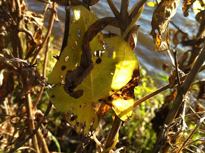
The last image is of a decaying butterbur. I love the way the huge leaves first start to change color from dark to a transparent light green, then get covered with brown spots, which become holes, and finally shrivel up and turn into a papery brown wad. Here the top leaf is still green, while the bottom leaf is already crumpled and faded. I used the bottom leaf as the main subject and chose soft greenish colors for the surrounding shapes. They emphasize the texture of the bottom leaf and gives it a bit of a 3D look.


vrijdag 7 oktober 2011


We visited the international school of philosophy in Leusden and i took some shots of their new hotel.
I used my Canon DSLR with a 17-85 mm f/4 - f/5.6 IS USM lens


Here are some impressions from the front side of the building. I tried to focus on the repetitive pattern of the thick wooden poles, the iron framework attached to them and the roof.
I really love the abundance and intensity of the warm colors

ISO 400 - 26 mm - f/16 shutter speed: 1: 1/25   2: 1/20  3: 1/20


ISO 400  1: 38 mm - f/16 1/30   2: 85 mm  - f/16 - 1/100
the last image was post-processed to enhance the details

the building is built in a curve, the front side convex, kind of coming towards you
and looming over you with its many impressive long tall poles.
the back side gives a completely different impression, more enclosed,
kind of withdrawing, eluding my camera when i got closer.
i enhanced this idea by changing my aperture settings
in the last shots the front pole is sharp while the rest of the building is out of focus


ISO 400 - 17 mm - f/18 - 1,7 EV - 1/13


ISO 200  1: 30 mm - f/5,6 - 1/50    2:  85 mm - f/5,6 - 1/40


ISO 200 - 59 mm - f/18 - 1/8


ISO 200 - 33 mm - -0,7 EV - f/5,6 - 1/50 

   ISO 200 - 38 mm - f/5,6 - 1/30    

Here are some photographs of the same building, taken by others
from the architect
from the builder
from an unknown unknown visitor